


Author : Yash R. Shiyani
Feature Scaling :
Feature scaling is a strategy for standardizing the data's independent features in a fixed range. It's done as part of the data pre-processing.

Working: Given a data-set with features - Age, Salary, BHK Apartment with the data size of 5000 people, each having these independent data features.
Each data point is labeled as:
Class1- YES (means with the given feature value one can buy the property)
Class2- NO (means with the given feature value one can’t buy the property).
Using dataset to train the model, one aims to build a model that can predict whether one can buy a property or not with given feature values. Once the model is trained, an N-dimensional (Here, N is the no. of features) graph with data points from the given dataset, can be created. The figure given below is an ideal representation of the model.

(Figure 1)
As shown in here, star data points belong to Class1 – Yes and circles represent Class2 – No labels and the model gets trained using these data points. Now a new data point (diamond as shown in the figure) is given and it has different independent values for the 3 features (Age, Salary, BHK Apartment) mentioned above. The model has to predict whether this data point belongs to Yes or No.
Prediction of the class of new data point :
The model calculates the distance of this data point from the centroid of each class group. Finally this data point will belong to that class, which will have a minimum centroid distance from it.
The distance can be calculated using these methods-
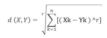
Euclidean Distance : It is the square-root of the sum of squares of differences between the coordinates (feature values – Age, Salary, BHK Apartment) of data point and centroid of each class. This formula is given by Pythagorean theorem.

where x is Data Point value, y is Centroid value and k is no. of feature values, Example: given data set has k = 3
Manhattan Distance : It is calculated as the sum of absolute differences between the coordinates (feature values) of data point and centroid of each class.

Minkowski Distance : It is a generalization of above two methods. As shown in the figure, different values can be used for finding r.
Need of Feature Scaling:
The given data set contains 3 features – Age, Salary, BHK Apartment. Consider a range of 10 - 60 for Age, 1 Lac - 40 Lacs for Salary, 1- 5 for BHK of Flat. All these features are independent of each of other. Suppose the centroid of class 1 is [30 , 20 Lacs , 3] and data point to be predicted is [55 , 30 Lacs , 2].
Using Manhattan Method,
Distance = ( | (30 - 55) | + | (2000000 - 3000000) | + | (3 - 2) | )
It can be seen that Salary feature will dominate all other features while predicting the class of the given data point and since all the features are independent of each other i.e. a person’s salary has no relation with his/her age or what requirement of flat he/she has. This means that the model will always predict wrong.
So, the simple solution to this problem is Feature Scaling. Feature Scaling Algorithms will scale Age, Salary, BHK in fixed range say [-1, 1] or [0, 1]. And then no feature can dominate other.
Techniques to perform Feature Scaling Consider the two most important ones:
Min-Max Normalization: This technique re-scales a feature or observation value with distribution value between 0 and 1

Standardization: It is a very effective technique which re-scales a feature value so that it has distribution with 0 mean value and variance equals to 1.

Feature Scaling :
""" PART 1 Importing Libraries """
import numpy as np
import matplotlib.pyplot as plt
import pandas as pd
# Sklearn library
from sklearn import preprocessing
""" PART 2 Importing Data """
data_set = pd.read_csv('C:\\Users\\dell\\Desktop\\Data_for_Feature_Scaling.csv')
data_set.head()
# here Features - Age and Salary columns
# are taken using slicing
# to handle values with varying magnitude
x = data_set.iloc[:, 1:3].values
print ("\nOriginal data values : \n", x)
""" PART 4 Handling the missing values """
from sklearn import preprocessing
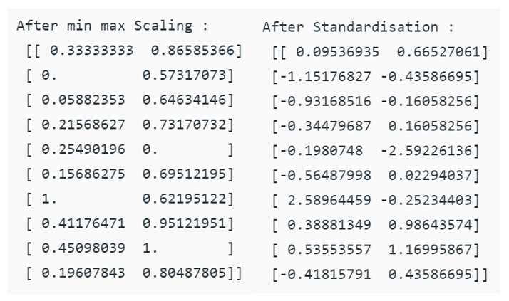
""" MIN MAX SCALER """
min_max_scaler = preprocessing.MinMaxScaler(feature_range =(0, 1))
# Scaled feature x_after_min_max_scaler = min_max_scaler.fit_transform(x)
print ("\nAfter min max Scaling : \n", x_after_min_max_scaler)
""" Standardisation """
Standardisation = preprocessing.StandardScaler()
# Scaled feature
x_after_Standardisation = Standardisation.fit_transform(x)
print ("\nAfter Standardisation : \n"x_after_Standardisation)Output :


Robust Scaler:
This uses a similar method to the Min-Max scaler but it instead uses the interquartile range, rather than the min-max, so that it is robust to outliers. This Scaler removes the median and scales the data according to the quantile range (defaults to IQR: Interquartile Range). The IQR is the range between the 1st quartile (25th quantile) and the 3rd quartile (75th quantile). The formula below is used:

Some more properties of Robust Scaler are:
Robust Scaler as 0 mean and unit variance
Robust Scaler has no predetermined range, unlike Min-Max Scaler
Robust Scaler uses quartile ranges and this makes it less sensitive to outliers
Python code for Feature Scaling using Robust Scaling :
import pandas as pd
import numpy as np
from sklearn import preprocessing
import matplotlib
import matplotlib.pyplot as plt
import seaborn as sns
%matplotlib inline
matplotlib.style.use('ggplot')

""" PART 2:  Making the data distributions """
x = pd.DataFrame({
 # Distribution with lower outliers
 'x1': np.concatenate([np.random.normal(20, 1, 2000), np.random.normal(1, 1, 20)]),
 # Distribution with higher outliers
 'x2': np.concatenate([np.random.normal(30, 1, 2000), np.random.normal(50, 1, 20)]),
})
""" PART 3:  Scaling the Data """
scaler = preprocessing.RobustScaler()
robust_scaled_df = scaler.fit_transform(x)
robust_scaled_df = pd.DataFrame(robust_scaled_df, columns =['x1', 'x2'])

""" PART 4:  Visualizing the impact of scaling """
fig, (ax1, ax2, ax3) = plt.subplots(ncols = 3, figsize =(9, 5))
ax1.set_title('Before Scaling')
sns.kdeplot(x['x1'], ax = ax1)
sns.kdeplot(x['x2'], ax = ax1)
ax2.set_title('After Robust Scaling')
sns.kdeplot(robust_scaled_df['x1'], ax = ax2)
sns.kdeplot(robust_scaled_df['x2'], ax = ax2)
Output:

Feature Mapping :
In data science one of the main concern is the time complexity which depends largely on the number of features. In the initial years the number of features was however not a concern. But today the amount of data and the features contributing information to them have increased exponentially. Hence it becomes necessary to find out convenient measures to reduce the number of features. Things that can be visualized can be comfortably taken a decision upon. Feature Mapping is one such of process of representing features along with relevancy of these features on a graph. This ensures that the features are visualized and their corresponding information is visually available. In this manner the irrelevant features are excluded and only the relevant ones are included.
This article, mainly focus on how the features can be graphically represented. A graph G = {V, E, W} is a structure formed by a collection of points or vertices V, a set of pairs of points or edges E, each pair {u, v} being represented by a line and a weight W attached to each edge E. Each feature in a dataset is considered a node of an undirected graph. Some of these features are irrelevant and need to be processed to detect their relevancy in the learning, whether supervised or unsupervised. Various methods and threshold values determine the optimal feature set. In context of feature selection, a vertex can represent a feature, an edge can represent the relationship between two features and a weight attached to an edge can represent the strength of relationship between two features. Relation between two features is an area open for diverse approaches.
Pearson’s correlation coefficient determines the correlation between two features and hence how related they are. If two features contribute the same information then one among them is considered as potentially redundant, this is because the classification would finally give the same result whether or whether not both of them are included or any one of them is included.

(Figure 2)
The correlation matrix of the features determines the association between various features. If two features are having an absolute value of correlation greater than 0.67 then the vertices representing those features are made adjacent by adding an edge and giving them weight equal to the correlation value. The features having association are the ones which are potentially redundant because they contribute same information. To eliminate the redundant features from these associated features, we use vertex cover algorithm to get the minimal vertex cover.
The minimal vertex cover gives us the minimal set of optimal features which are enough to contribute the complete information which was previously contributed by all these associated features. This way we can reduce the number of features without compromising on the information content of the features.
Thus the optimal set of features are relevant with no redundancy and can contribute information as the original dataset. Reducing the number of features not only decreases the time complexity but also enhance the accuracy of the classification or clustering. This is because many times a few features in the dataset are completely redundant and divert the prediction.
References :
https://www.analyticsvidhya.com/blog/2020/04/feature-scaling-machine-learning-normalization-standardization/
https://en.wikipedia.org/wiki/Feature_scaling
https://johnfergusonsmart.com/feature-mapping-a-lightweight-requirements-discovery-practice-for-agile-teams/
GitHub Link :
https://github.com/YashShiyani/Feature_Scaling_and_Feature_Mapping/blob/main/Feature_Scaling_and_Feature_Mapping.pdf
Comments