Author-Dhruv Shrivastava
Data Analytics has been changing the fundamentals of various businesses for quite some time. Good data analysis creates a great impact on the productivity of different businesses. Data analytics is not a new development. Analytics has been a part of Business Intelligence (BI) from the very beginning, many BI tools used analytics to better understand and interact with data. Data Analysis is used for manipulating, transforming, and visualizing data in order to infer meaningful and important information from the data. Big industries, businesses, and government also uses data analysis to take direction based on those insights .
Introduction:-
In this we will discuss how ML is used in data analysis and implement some machine learning algorithms to perform data analysis. Machine learning leverages algorithms to analyse vast amount data and develops an algorithm that can understand the data much faster and without any human support and computing every data combination to understand the data holistically. We will also see different types of data analysis and what are the real-life examples of them.
Many of you might be wondering why ML is used now for data analysis, this is because the traditional analysis that was used before used spreadsheets for analysis but now as there is vast amount of data, doing analysis on spreadsheets is impossible. These limitations have paved a way for Machine learning to take hold in data analytics. As more customer data grows, so do the opportunities to better understand the needs of target customers. To capitalize on this data, more businesses are using data analysis to promote data- driven decision-making which provides a competitive advantage.

Figure-1: Data Analysis
Why Machine Learning is useful in Data Analysis?
Machine learning automates the entire data analysis workflow. When we assign machine with different tasks like classification, clustering, and anomaly detection which are important tasks at the core of data analysis—we are employing machine learning.
The amount of data that the companies have access to is much greater now that’s why with these machine learning techniques we can determine the insightful understanding of this vast amount of data.
With ML we can design self-improving learning algorithms that can take data as input and offer statistical inferences. We can make algorithms which can make decisions whenever they detect a change in pattern without relying on hard-coded programming.
As popular and developed these machine learning models are, we still need human support to derive the final implications of data analysis. Making sense of raw data and to clean that data is still up to humans.

Figure-2
Types of Data Analysis:
Descriptive Analysis:
It is used to describe and summarize information from samples and population.
This is very first analysis that is to be performed.
It gives common descriptive statistics like frequency, positions etc.
generates simple summaries of data like sample and measurements.
Example: Descriptive statistics about a college involve the average science score for students. It says nothing about why the data or what trends we can see and follow.
Exploratory Analysis (EDA):
It is used to explore the data and find relationships between variables which were previously unknown.
It gives us correlation between different features in our data.
Useful for making hypothesis and drives design planning and data collection.
Example: One example of EDA is analysis of change in temperature due to global warming. We can take rise in temperature in specific time and increase in human activities like increase in pollution etc which will give high correlation and we can find relationship between them.
Inferential Analysis:
It is used on small sample of data to infer about a larger population.
Accuracy of inference depends on the sample like if sample isn’t representative of larger population, then the analysis can be wrong.
It gives conclusion of whole population with sample of that population data.
Example: Survey that are conducted by organizations about various things like benefits of running or benefits of sleeps etc are generally conducted on sample of people and not the whole population. This survey is from sample of people like 500-700 people which is just a tiny portion of 7 billion people in the world, thus an inference of the larger population.
Predictive Analysis:
Using previous or historical data to find patterns in data to make predictions about the future.
Performance of the analysis depends on input variables.
Performance also depends on type of model
Example: Analysis of stock market can be a great example of predictive analysis. We can use historical data of stock market to predict the pattern in the rise of stocks and thus can predict rise of future stocks.
Casual Analysis:
It analysis the cause and effect of relationship between features.
It focuses on finding the cause of correlation between features.
It is applied in randomized studies focused on identifying causation.
Example: let’s say there is new medicine and you want to know whether it will benefit the humans or not. To analyse this, you compare the sample of candidates for your drug vs the candidates receiving tests for benefits of this drug and observe how the drug affects the outcome.
Implementation:
Now that we know different types of data analysis, lets implement some of them on dataset containing data of Wine quality dataset. We will be doing detailed analysis and try to implement each type of data analysis. It is a good practice to understand the data first before implementing the machine learning model. With proper analysis we will be able to make sense of data and gather insights from it.
Step 1: Importing libraries and loading data:
To start with data analysis first we will import the necessary libraries like pandas, numpy, seaborn, matplotlib and use read_csv method to load the dataset.
import pandas as pd
import numpy as np
import matplotlib.pyplot as plt
import seaborn as sns
%matplotlib inline
data = pd.read_csv('winequality-red.csv',sep=';')
data.head()
Dataset has 1599 rows and 12 columns and we have one dependent variable which is ‘quality’ column.
It is also a good practice to get information about columns and type of data they have or whether they have null values or not. If there are null values then we will clean the data.
Code:
data.info()Output:

From this we can see that there are no null values in our data.
All the data in our dataset is int or float.
Step 2:
Now that we know there are no null values, let us move forward with Descriptive analysis of dataset, we will be doing this by describe method.
Code:
data.describe()Output:

By doing descriptive analysis we get common descriptive statistics like frequency, positions, max, min and generates simple summaries of data like sample and measurements.
There is notably a large difference between 75th percentile and max values of “residual sugar”, “free sulfur dioxide”, “total sulfur dioxide”.
We can also see large difference between mean and median value so from these observations we gather that there are outliers in our data.
Now we will see the target variable and gather some key insights from it:
data.quality.unique()
Target variable is categorical in nature.
Target variable value ranges between 1 to 10 where 1 is very poor and 10 is best.
1,2 and 10 ratings are not given to any observation.
data.quality.value_counts()
Value_counts give us the count of each quality in descending order.
Most of the quality is 5, 6, 7.
Step 3:
Now, we will see the relationships between each feature and we call this type if analysis as Exploratory analysis (EDA). We will see the correlation between features and we will do this by using python visualization library, Seaborn which is build on top of matplotlib.
To find the correlation we will us ‘corr ()’ function.
We will display the correlation by using heatmap.
#Quality correlation matrixk = 12 #number of variables for heatmapcols = data.corr().nlargest(k, 'quality')['quality'].indexcm = data[cols].corr()plt.figure(figsize=(10,6))sns.heatmap(cm, annot=True, cmap = 'coolwarm')
Figure-3
Here we can see that ‘density’ have good positive correlation with ‘fixed acidity’ and it has high negative correlation with ‘alcohol’.
“pH” and “free sulphur dioxide” have almost zero correlation and “volatile acidity” and “residual sugar” have zero correlation.
Zero correlation means no linear relationship between the two features. And if you are applying linear regression and its better to drop these types of columns.
Step 4: Data Visualization:-
Now that we know the relationship between different feature lets explore the data with beautiful graphs.
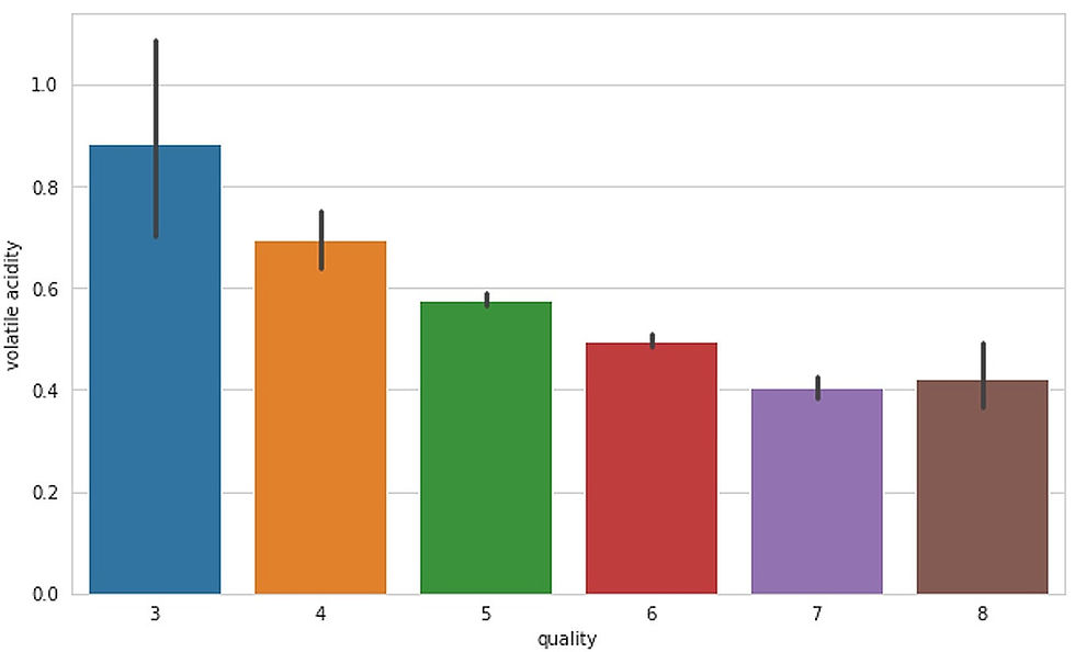
Figure- 4
Here we can see that as the quality improves, the volatile acidity decreases.

Figure-5
Here we can see that Composition of citric acid go higher as we go higher in the quality of the wine.
Our target variable ‘quality’ has a high correlation with ‘alcohol’. Lets make graph between them.

Figure-6
We can see that Alcohol level also goes higher as the quality of wine increases.
We can make more graphs between different features and explore the data completely.
Step 5: Pre-processing our data :-
Code:
bins = (2, 6.5, 8)
group_names = ['bad', 'good']
data['quality'] = pd.cut(data['quality'], bins = bins, labels = group_names)

label_quality = LabelEncoder()
data['quality'] = label_quality.fit_transform(data['quality'])
data['quality'].value_counts()
sns.countplot(data['quality'])
Code Explanation:
Making binary classification for the response variable.
Dividing wine as good and bad by giving the limit for the quality.
Assigning a label to our quality variable, Bad becomes 0 and good becomes 1.
Fitting the newly encoded data to our target column.
Making count plot.
Output:

Figure- 7
We can see from count plot that our data is imbalanced and making predictions with imbalanced data does not provide good model performance.
To solve the imbalanced data problem there are various methods but we can solve this solve this by simple method which is using random forest machine learning model.
Step 6: Implementing the model:-
First, we will split the data into train and test data.
Code:
X = data.drop('quality', axis = 1)
y = data['quality']
from sklearn.model_selection import train_test_splitX_train, X_test, y_train, y_test = train_test_split(X, y, test_size = 0.2, random_state = 42)
sc = StandardScaler()
X_train = sc.fit_transform(X_train)
X_test = sc.fit_transform(X_test)
rfc = RandomForestClassifier(n_estimators=200)
rfc.fit(X_train, y_train)
pred_rfc = rfc.predict(X_test)
print(classification_report(y_test, pred_rfc))
print(confusion_matrix(y_test, pred_rfc))
Code explanation:
Now separate the dataset as response variable and feature variables.
Train and Test splitting of data.
Applying Standard scaling to get optimized result.
Implementing random forest model with number of estimators=200.
Printing classification report and confusion matrix to see how our model performed.
Output:

Figure 8: Model performance
Our model showed 89 Percent of accuracy which good considering the data is imbalanced. Although the precision, recall, and f1-score of 1 class is not very good.
We can use different model and with some hyperparameter tuning we can do better job but I think this much would be enough to understand the concept.
Conclusion:
In this article, I have explained how machine learning is used in data analysis and types of data analysis that are used in analysis. I have also explained basic steps of data analysis that you can follow whenever you are working with dataset. You can try to implement different model and see how it performs. We can see how Machine learning helps in data analysis and how it makes the analysis easy and conclusive. In this article we used small amount of data for analysis but in companies the amount of data is much more and by machine learning we can gain useful information from that data.
Please find the dataset and the complete notebook in my GitHub.
GitHub link:
References:
https://www.answerrocket.com/data-analytics-machine-learning/
https://www.udacity.com/blog/2020/08/machine-learning-for-data-analysis.html
https://towardsdatascience.com/exploratory-data-analysis-8fc1cb20fd15
https://www.kaggle.com/uciml/red-wine-quality-cortez-et-al-2009
https://www.google.co.in/search?q=data+analytics&tbm=isch&ved=2ahUKEwj677uS46XxAhUh5zgGHfAQCGsQ2-cCegQIABAA&oq=data+analytics&gs_lcp=CgNpbWcQAzIFCAAQsQMyAggAMgIIADICCAAyAggAMgIIADICCAAyAggAMgIIADICCABQvYEBWI2MAWCVkAFoAHAAeACAAa4BiAHmC5IBBDAuMTKYAQCgAQGqAQtnd3Mtd2l6LWltZ8ABAQ&sclient=img&ei=vvnOYPqYLqHO4-EP8KGg2AY&authuser=0&bih=947&biw=1903&hl=en#imgrc=PgVBeQlaI7JUlM&imgdii=0zJ5rHXqP3fhAM
Comments