Authors: Abhinav kale, Rimpa poria
Seaborn is used for data visualization and exploratory data analysis. It is based on Matplotlib. It provides a high-level interface for drawing attractive and informative statistical graphics. Seaborn works easily with data-frames and the Pandas library. The graphs created can also be customized easily. Below are a few benefits of Data Visualization.
Graphs can help us find data trends that are useful in any machine learning or forecasting project.
Graphs make it easier to explain your data to non-technical people.
Visually attractive graphs can make presentations and reports much more appealing to the reader.
Functionalities of seaborn
Allows comparison between multiple variables
Supports multi-plot grids
Univariate and bivariate visualization
Availability of different color palettes
Estimates and plots linear regression line
Installation
Open terminal program (for Mac user) or command line (for Windows) and install it using following command:

Seaborn library provides a variety of datasets. Plot different visualization plots using various libraries for the 'tips' dataset.
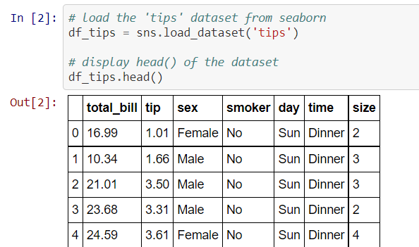
Figure_1
Different types of plots
Strip plot
It is similar to the scatter plot with one categorical variable.
It is used to understand the underlying distribution of the data.
One axis represents the categorical variable and another represents the value corresponding to the categories.
Plot a strip plot to check the relationship between the variables 'tip' and 'time'

Figure_2
We see that the tip amount is more at dinner time than at lunchtime. Nevertheless, the above plot is unable to display the spread of the data. We can plot the points with spread using the 'jitter' parameter in the strip plot function.

Figure_3
The plot shows most of the observations the tip amount is in the range 1 to 4 irrespective of time.
Swarm plot
It is the combination of strip and violin plots
The points are adjusted in such a way that they don’t overlap, which gives the better representation of the data
Plot the swarm plot for the variables ‘tip’ and ‘time’.

Figure_4
The above plot gives a good representation of the tip amount for the time. It can be seen that the tip amount is 2 for most of the observations. We can see that the swarm plot gives a better understanding of the variables than the strip plot.
We can add another categorical variable in the above plot by using a parameter 'hue'.

Figure_5
The plot shows that the tip was collected at lunch only on Thursday and Friday. The amount of tips collected at dinner time on Saturday is the highest.
Distribution plot
It displays the distribution of the data
It is a variation of histogram that uses kernel smoothing to plot values, allowing for smoother distributions by smoothing out the noise
Lets plot a distribution plot of 'total_bill'.

Figure_6
We can interpret from the above plot that the total bill amount is between 10 to 20 for a large number of observations. The distribution plot can be used to visualize the total bill for different times of the day.

Figure_7
It can be seen that the distribution plot for lunch is more right-skewed than a plot for dinner. This implies that the customers are spending more on dinner rather than lunch.
Count plot
It is similar to the bar plot. However, it shows the count of the categories in a specific variable. Count plot shows the count of observations in each category of a categorical variable. We can add another variable using a parameter 'hue'.
Let us plot the count of observations for each day based on time.

Figure_8
All the observations recorded on Saturday and Sunday are for dinner. Observations for lunch on Thursday is highest among lunchtime.
Regression Plot
It is used to study the relationship between the two variables with the regression line. Regression plot is a plot which gives the relationship with two quantitative variables.
The line regression plot in this library plots the data and the fitted regression model.

Figure_9
The above plot is a scatter plot of the tip against the total bill. We may say as the bill amount increases the tip amount also increases, that is, there is an increasing trend.
Let us plot a regression plot of total_bill against the size. We shall take the average of values from the regression plot.

Figure_10
We see there is a lot of variation as the size increases.
Point plot
It represents an estimate of central tendency (by default, mean) by position of scatter points and provides the indication of the uncertainty around that estimate using error bars. A point plot is a plot between two categorical variables and a numeric variable. It represents the measure of central tendency. The point indicates the mean and the lines indicate the variation. These plots are useful for comparison between different levels of one or more categorical variable.
Let us plot a day-wise point plot of the total_bill collected.

Figure_11
We see that the blue line indicates the summary statistics for dinner orders and red line indicates the summary of lunch orders . The average of total_bill for dinner is higher on all days.
Joint plot
A joint plot is a bivariate plot along with the distribution plot along the margins.

Figure_12
We see there is a nearly linear relationship between the total bill and the tip. Along the margins, we see the kernel density plot for the variables.
It is possible to plot the distribution plot or even histogram. Also, the scatter plot can be replaced by the regression plot.
Violin Plot
It is similar to a boxplot, that displays the kernel density estimator of the underlying distribution
It shows the distribution of the quantitative data across categorical variables such that those distributions can be compared.
Let's draw a violin plot for the numerical variable 'total_bill' and a categorical variable 'day'.

Figure_13
The above violin plot shows that the total bill distribution is nearly the same for different days. We can add another categorical variable 'sex' to the above plot to get a better insight on the bill amount distribution based on days as well as gender.

Figure_14
There is no significant difference in the distribution of bill amount and sex.
Pair Plot
It displays the pairwise relationship between the numeric variables
The pairplot() method creates a matrix; where the diagonal plots represent the univariate distribution of each variable and the off-diagonal plots represent the scatter plot of the pair of variables
Plot a pair plot for the tips dataset.

Figure_15
The above plot shows the relationship between all the numerical variables. 'total_bill' and 'tip' has a positive linear relationship with each other. Also, 'total_bill' and 'tip' are positively skewed. The 'size' has a significant impact on the 'total_bill', as the minimum bill amount is increasing with an increasing number of customers (size).
Heatmap
A heatmap is a two-dimensional graphical representation of data where the individual values that are contained in a matrix are represented by the different colors
Heatmap for correlation shows the correlation between the variables on each axis
Compute correlation between the variables using .corr() function. Plot a heatmap of the correlation matrix.

Figure_16
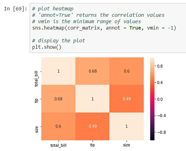
Figure_17
The above plot shows that there is a moderate correlation between 'total_bill' and 'tip' (0.68). The diagonal values are '1' as it is the correlation of the variable with itself.
Github:
References:
https://www.kaggle.com/rakesh6184/seaborn-plot-to-visualize-iris-data
https://towardsdatascience.com/how-to-use-seaborn-for-data-visualization-4c61fc488ec1
https://www.section.io/engineering-education/seaborn-tutorial/
https://jakevdp.github.io/PythonDataScienceHandbook/04.14-visualization-with-seaborn.html
https://scikit-learn.org/stable/auto_examples/datasets/plot_iris_dataset.html
Comments